[vc_row][vc_column][vc_column_text css=”.vc_custom_1540972938528{margin-bottom: 0px !important;}”]If you’re having a hard time trying to choose a color for your current project and need some help with your interior painting color ideas, looking at the coming Color of the Year can be of great help. According to Wikipedia, Pantone, who are best known for their Pantone Matching System, which is a proprietary color space used in many design markets, has been doing this since 2000. It’s a great reference for anyone looking for colors.
Since Pantone started this trend, every major paint company has followed suit and announced their own color of the year. Below, I’m going to go over the 4 major companies’ picks with you, except Pantone, who doesn’t release their choice until December. However, if you’d like to see a previous years color, check out this blog we we wrote about the Color of the Year 2015 – Marsala.
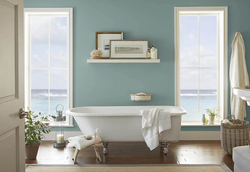
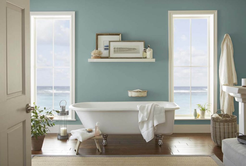
Sherwin Williams is one of the most well known paint companies around, having been founded in 1866. And it’s awesome that their headquarters have always been right here in Cleveland, Ohio! Since we’re also based out of Cleveland, I figured I’d start with them. Sherwin Williams has been doing Color of the Year since 2011 and announced this years color as “Oceanside SW 6496”. It’s described on their website as a “collision of rich blue with jewel-toned green”. They said it is “accessible and elusive” and that it is a “complex, deep color that offers a sense of familiar with a hint of the unknown”.
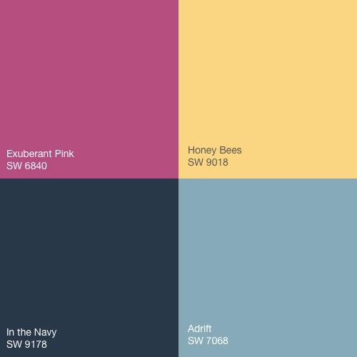
Great! Now, what do we do with that? What kind of colors do we match it with? Well, luckily for us, Sherwin Williams gave a list of colors that they think pair great with their pick – Exuberant Pink SW 6840, Honey Bees SW 9018, In The Navy SW 9178, and Adrift SW 7608.
Personally, I love this color. It feels very homey and warm to me. I’d love to have this color in an office or a family room, since it feels very relaxing. Or even as an accent on a wall in a dining room. I think this color would actually go great as the accent color in the shelves our local house painters painted in this house.
Our next color comes from Behr, another well known paint company. Based out of California, they were founded in 1947. Behr products can exclusively be found at The Home Depot. Color of the Year is new to their annual Color Trends announcement. Their choice for their introductory year is “In the Moment T18-15”.
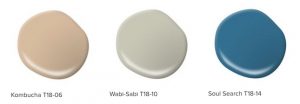
Behr describes this color as a “Cool, tranquil, spruce blue” that is “inspired by nature and is a soothing, restorative coalescence of blue, gray and green”. They continue with this “comfortable color evokes a sense of sanctuary and relaxation” and that it is “versatile and perfect to use for both interior and exterior”. Behr thinks “In this Moment” would pair well with a few other colors – “Kombucha T18-06”, “Wabi-Sabi T18-10”, and “Soul Search T18-14”. They think all these colors could help you create a mindful space.
I love this color as well. I feel like I can definitely pull all 3 of those colors out when I’m looking at it. For example, if you were to say green, you see the green. If you say blue, you can see the blue. And yet, you still see the grey with both of those colors. I think that’s pretty cool. This color makes me think of a cool day at the beach, or a slightly chilly fall day. I think this color would go really well on a backporch, actually. I think you could use this color in any room of your house, inside or out, and that you could find a million other colors or decorative items that would pair well with it.
The next company on our color adventure is PPG Industries. This company used to be called Pittsburgh Plate Glass Company and was founded in 1883. They’re still based out of Pittsburgh, Pennsylvania. Their Color of the Year choice is “Black Flame PPG1043-7”. “Statement making black, infused with an undertone of the deepest indigo, evokes privacy, hope and classic modernism” is how it’s described on their website. It’s considered “dressed-up, unapologetic, and timeless”.
PPG unfortunately doesn’t have a set list of colors that they think would pair well with this one. They did make a 2018 Color Trend that has a grouping of colors in it, none of which are the Color of the Year though, which is odd, in my opinion. However, I do think “Black Flame PPG1043-7” would go well with either “The COMMoner” or The “Brave” color palettes.

Timeless is exactly what I think of when I see this color. It feels like a color I’ve seen before, and yet is different at the same time. I feel it has a sort of elegance that comes along with it, probably since black and indigo are considered very refined colors. I think this color would look great in a dining room. I can just picture a fancy dinner party going on, with this color as the background.
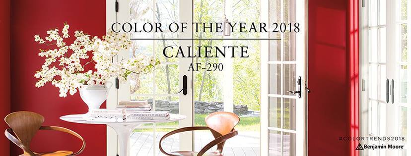
The last company on our journey is Benjamin Moore, which was founded in 1883 and is based out of Montvale, New Jersey. “Caliente AF-290” is by far the boldest of the Color of the Year 2018 choices. “Strong, radiant, full of energy” is in big letters on their website describing this color. And it is so true. It is very much a “stop you in your tracks” color. Not for the faint of color heart, if you will.
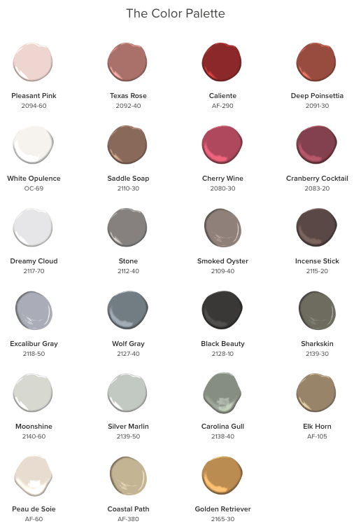
Benjamin Moore also does not have a set list of colors they think pair well. Instead, they put together a 2018 color palette. In my opinion, it looks like you could pair any of those colors together nicely with the “Caliente AF-290”.
This color from Benjamin Moore is by far the brightest in the bunch. It basically just screams “red” in your face, and that’s not necessarily a bad thing. I think this color could be used to really brighten a space up, as it’s very eye catching. For me, I’d love to see this color in my bathroom, as it’s a small space and I think it would make it feel bigger. If you want a dramatic change, “Caliente AF-290” is definitely the color of the year for you.
Those are our 4 major paint companies and their Color of the Year 2018 choices. “Oceanside SW 6496”, “In the Moment T18-15”, “Black Flame PPG1043-7”, and “Caliente AF-290” are all colors that you could easily incorporate into your house together if you wanted to. For me, I’d love “Caliente AF-290” in my bathroom, as I said. “Black Flame PPG1043-7” would look amazing in my dining room; “In the Moment T18-15” in my kitchen and back porch, and “Oceanside SW 6496” in my bedroom. I think they would give each room their own personality that they’re currently lacking.
 What’s your favorite Color of the Year? Have any great design ideas that you could see with these colors? Want us to help you with your interior painting or exterior painting project? Let us know what you think in the comments below or click the link below!
[/vc_column_text][/vc_column][/vc_row]