2024’s Paint Colors of the Year: Refresh Your Cleveland Home’s Look!
The 2024 Paint Color Trends have been announced by the major paint companies, and for those of us who are on the edge of our seats waiting to see which vibrant hues will be named, the anticipation is finally over.
Unlike the bold and bright colors we saw last year, this year’s picks lean more toward rich and deep shades. Say goodbye to those plain white walls that ruled the roost for the past few years. Feeling inspired to grab a paintbrush and give your home a whole new look?
Check out the hottest paint colors of 2024 right here!
So, we’re diving into 2024’s color palette, and it’s all about bringing that natural, earthy feel into your home. Let’s start with the two big paint manufacturers:
1. Blue Nova – A Luxurious Fusion of Violet and Blue by Benjamin Moore
Tired of blues that just fall flat?
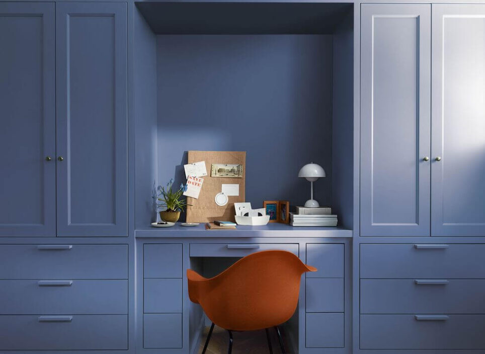
Benjamin Moore Blue Nova is a deep, striking color. It’s an elegant mid-tone blue that makes you think of the sky just after sunset. It’s got a bit of a red undertone, which gives it this unique violet glow. Super versatile, you can splash it on an accent wall or go bold and paint a whole room. It’s a great paint color choice if you hire a professional painting company to paint your living room or maybe even your home office.
-Courtesy of BenjaminMoore.com
Ideal for spaces like offices, bedrooms, and even kitchen islands, Blue Nova is the go-to color if you want to make a statement. Keep in mind, though, that you’ll want plenty of natural light to rock this shade. Rooms facing north with limited windows can turn Blue Nova almost black.
Why Blue Nova?
This color isn’t your average blue; it’s a bold statement, a vibe, and a trendsetter all rolled into one. Join us as we explore the unique qualities that make Blue Nova stand out and why it’s taking center stage in interior design. It’s perfect for creating a space that feels both modern and a bit classic.
Here’s why Blue Nova is gearing up to be a favorite color in home decor:
Blue Nova is like that laid-back friend with a touch of warmth. It easily pairs with rich colors, making it a calming and versatile pick for various design aesthetics.
1. Cosmic Inspiration: Drawing inspiration from the vast cosmos, Blue Nova taps into a theme that’s making waves in today’s design scene. Its connection to stars and galaxies adds an element of mystery and wonder, distinguishing it from more grounded gray tones.
2. Shift in Palette: After the lively Raspberry Blush of the past year, Blue Nova marks a significant and refreshing shift. Moving away from playful, bright hues, it embraces a more sophisticated and contemplative shade, signaling a new direction in design trends.
3. Versatile and Mood Setting: Despite its depth, Blue Nova is incredibly versatile. It effortlessly sets various moods, whether you’re going for a serene vibe or aiming for something bold and dramatic. This adaptability makes it a great fit for a wide range of interior styles and personal tastes.
4. Trendsetting Potential: As the designated Benjamin Moore Color of the Year, Blue Nova is positioned to influence broader design trends. Its distinctiveness and widespread appeal extend beyond interior design, potentially leaving its mark on fashion, art, and lifestyle.
Accent Colors:
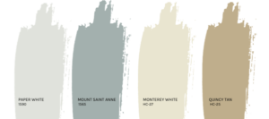
Light grays and creamy whites are no-brainers; they make the blue stand out without screaming for attention.
For a bolder look, mustard yellows or burnt orange can add a playful contrast to Blue Nova.
Different Shades:
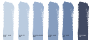
These similar hues help you decorate with Blue Nova to make this color really pop while still creating a comfortable and stylish home.
Discover new horizons by exploring new places, thoughts, and colors, and let your creativity run wild.
 How Will Blue Nova Look In Your Home?
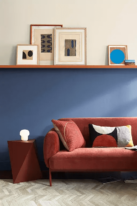
Living Room: Imagine one wall in Blue Nova, making your living area feel like a cozy evening all the time. Have a blast with colors by mixing shades, tints, and contrasts. Experiment with vibes,
blending old-school and modern styles to nail the perfect paint palette for your space.
Home Office: A Blue Nova backdrop in your workspace? Talk about inspiring! Blue Nova can spark creativity and enhance focus. Whether it’s on a single wall or in accessories, this color brings a
feeling of calm and concentration—perfect for a productive workspace.
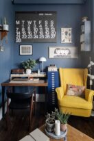
-Courtesy of The Modern House
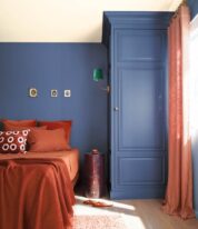
Bedroom: Blue Nova brings a calming vibe. Pop it on the wall behind your bed, and pair it up with lighter bedding and curtains. That combo sets up a peaceful, relaxing space – just what you need
to unwind after a hectic day.
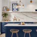
 Kitchen: Blue Nova is an excellent choice if you are thinking about having your kitchen cabinets professionally refinished. In this home, they matched blue cabinets with beige tones for a stylish look, and the result is a kitchen that is both trendy and timeless. (The exposed brick certainly looks amazing as well with these blue cabinets!)
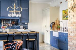
-Photo by Henrik Linden for Alvhem
Exterior: Blue Nova can add a unique touch to your front door, making your home stand out. Combine it with stone accents or natural wood for a truly eye-catching exterior.

2. Upward – Tranquility in Denim Blue by Sherwin-Williams
Upward is a light blue-gray that can have a slight purple undertone. It most often looks like a slightly more neutral version of baby blue.
It embodies a subtle push forward in our daily lives. It channels the carefree and sunny-day energy, bringing forth a feeling of contentment and peace. This shade encourages its customers to embrace this color as an opportunity to pause and introduce a fresh sense of ease and possibility into their surroundings. According to Sue Wadden, the director of color marketing at Cleveland’s own Sherwin-Williams, “It’s about creating an atmosphere that doesn’t overpower but fosters meditation and tranquility.”
Why Upward Stands Out?
Upward is your go-to for creating a relaxed vibe and total zen, whether at home or in your workspace. If you’re into a classic coastal feel or prefer a laid-back Nordic style, this breezy blue shade is where the gentlest blues meet a hint of silvery shine.
Here are all of the colors from the Upward color strip:
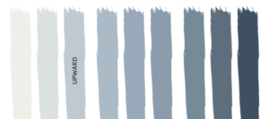
So, if you’re into something a bit brighter than Upward, consider Sherwin Williams North Star—the lighter sibling on the color strip.
On the flip side, if you’re looking for a deeper vibe than Upward, I’d steer clear of Windy Blue and head straight to Aleutian. And for a seriously dark gray-blue companion, you might just fall in love with Cyberspace.
Other Coordinating Colors for Upward:
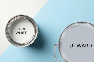
Upward with Pure White
Pure White is a tried and true white from Sherwin Williams that not only coordinates well with Upward it is also from a very complementary beige color family.
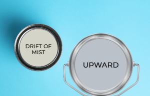
Upward with Drift of Mist
Drift of Mist is a light, almost off-white neutral that would be a smooth and creamy wall color to pair with Upward.
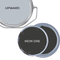
Upward with Iron Ore
Iron Ore is a deep charcoal that actually looks quite cool. The cool blue tones in both of these colors will pair well together.
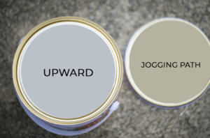
Upward with Jogging Path
Jogging Path is a neutral greige paint color that isn’t super popular…yet! This one pairs beautifully with Upward as a complementary color.
How Will Upward Look In Your Space?
This cool-toned hue fits right in with different styles like grandmillennial and Art Deco. If you’re keen on adding this color to your home, try it out on an accent wall or ceiling. It’s perfect for giving kitchen cabinets a facelift, adding a pop to your bathroom vanity, making your front door pop, or giving a new lease of life to an old piece of furniture. Here are great examples of what I find to be the most common look for Upward:
Kitchen: Apart from Blue Nova cabinets, you can also consider Upward for a kitchen island. Pair it with natural wood tones and brushed nickel fixtures for a fresh, inviting look.
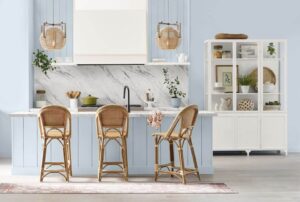
Bedrooms: Upward on bedroom walls creates a tranquil haven. It’s like sleeping under an open sky.

Bathrooms: For a spa-like feel, Upward in the bathroom is a winner. Add some fluffy white towels,
and you’re set.

Exterior: Why not? Upward could be a fantastic choice for your home’s interior or exterior, especially if you’re going for a serene, coastal vibe.

In short, 2024’s colors are all about creating spaces that feel both fresh and familiar. Whether you’re painting a whole room, adding a splash of color to your kitchen, or giving your home’s exterior a new vibe, Blue Nova and Upward offer endless possibilities. And remember, the right accents can make all the difference. So, get creative and start transforming your home into a 2024-inspired haven! Please let us know if we can help you to utilize one of these trendy colors in 2024!


