Paint Color Trends For 2020
Blue Is Hot For 2020!
As we enter a new decade, the major paint manufacturers as well as Pantone have released their prognosis as to the popular paint colors for 2020. Similar to showing up to a party wearing the same outfit as someone else, three of the four companies are all looking at each other with that “that looks familiar” look as they all selected similar shades of blue. Benjamin Moore went in a different direction with a pale pink color. Let’s take a look at each company’s selection and discuss where you might choose to use these colors in your home decor.
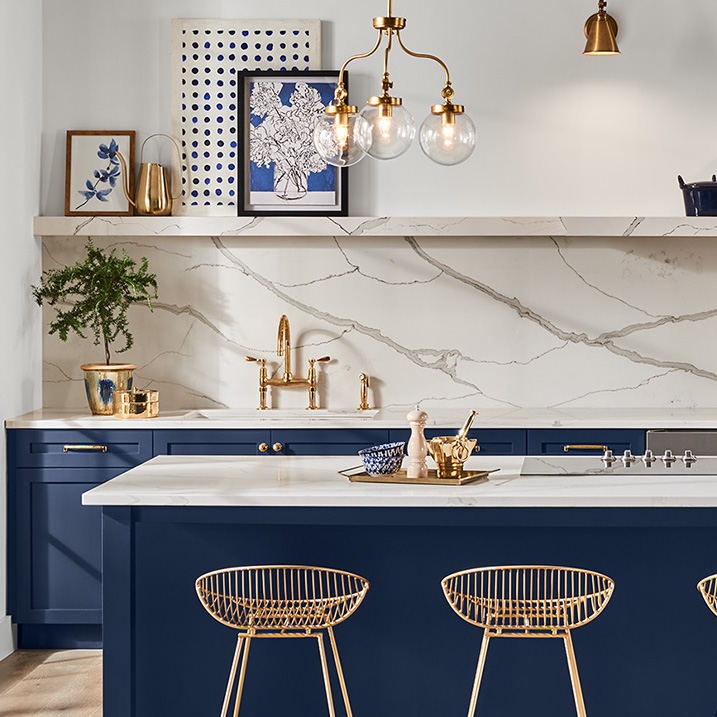
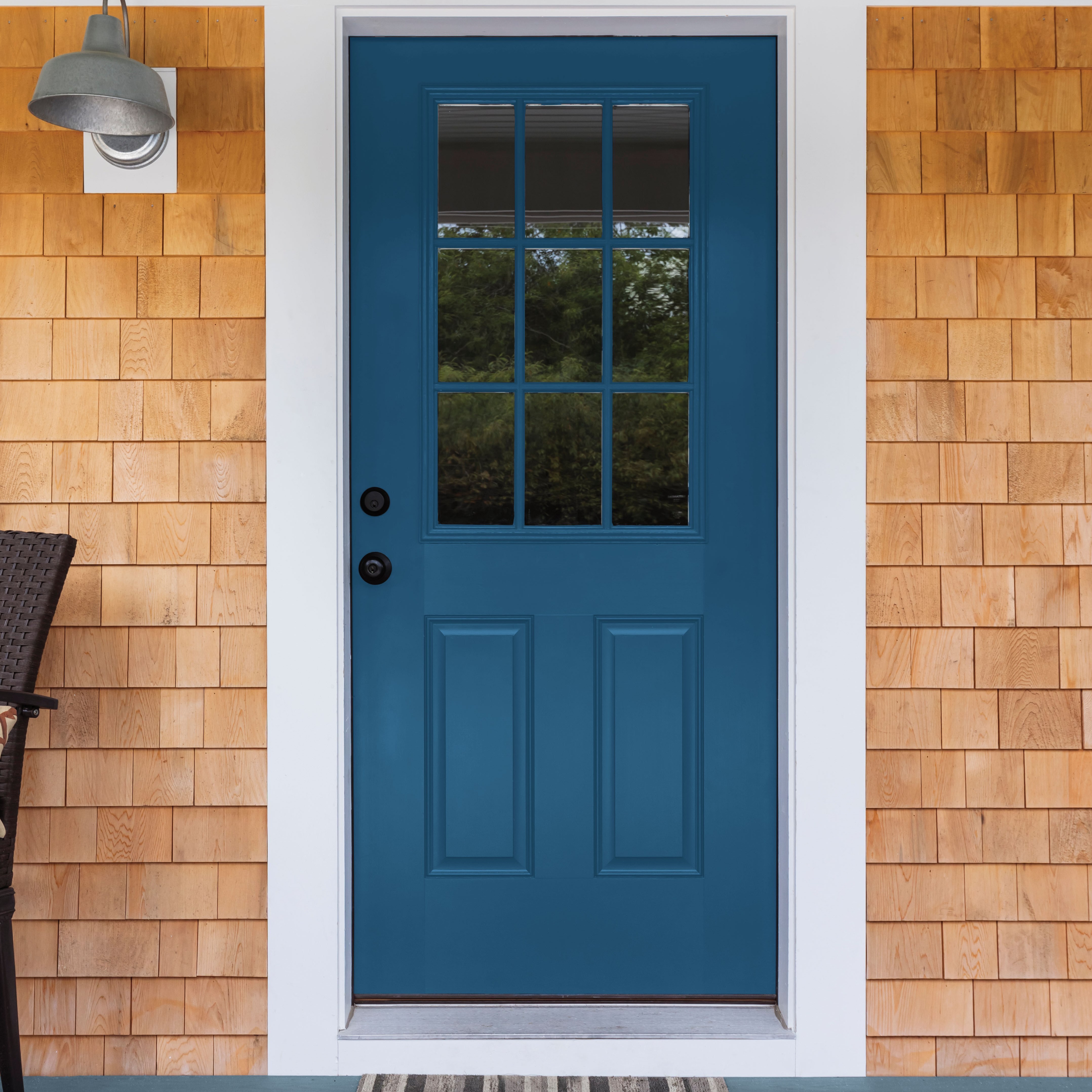
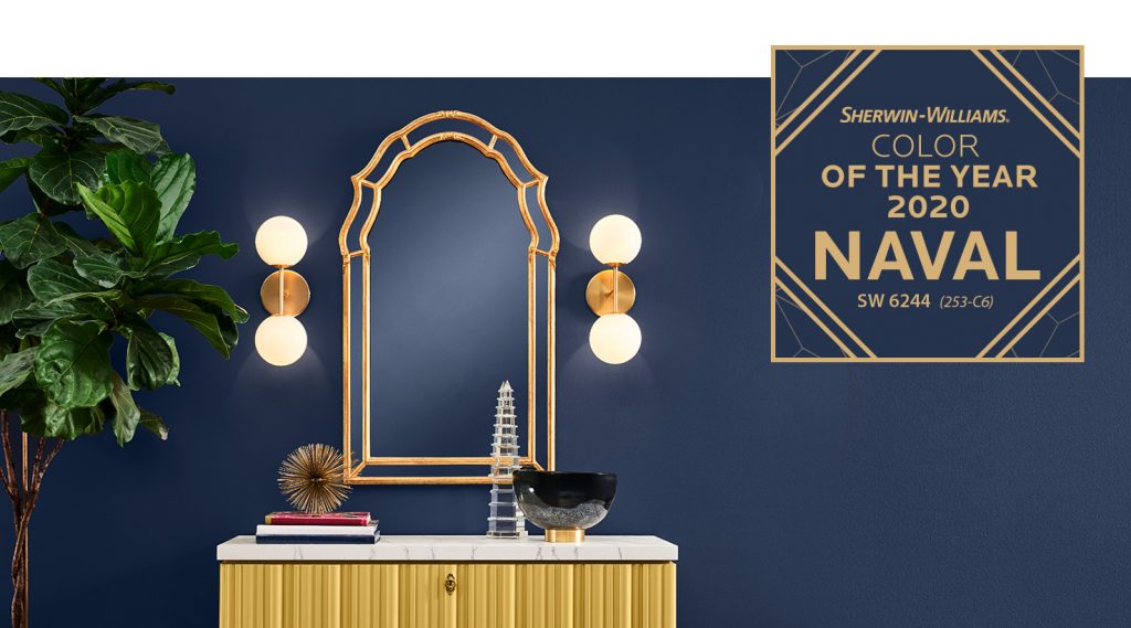
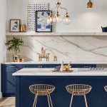
One of our favorite colors to use when painting kitchen cabinets, Naval has been selected as the Sherwin Williams Color of the Year for 2020. This is a dark navy blue with a lot of black tint. According to Sherwin Williams, “This deep shade evokes a prominent sense of confidence that fuses timeless color with a fresh mix of natural materials and textures that bring navy blue into a new era.”
This color has been popular for about two years and we have painted a handful of kitchens in the “tuxedo look” using this color on the bottom with white upper cabinets. It looks especially sharp with gold or copper handles!
This color looks great on the outside of a home as a main body color and can bring a lot of depth to interior rooms as well. Used in a small room, Naval makes the room very intimate. You can also use this color in rooms with white and off-white wood trim (like ship lap) on part of the wall for a very attractive look.
Naval is a beautiful color to subtly hide in the background allowing other colors to pop. This color would pair well with a lot of bright colors like yellow, pale purple or even lime green. Actually, it would look great in a space paired with Benjamin Moore’s color of the year “First Light”.
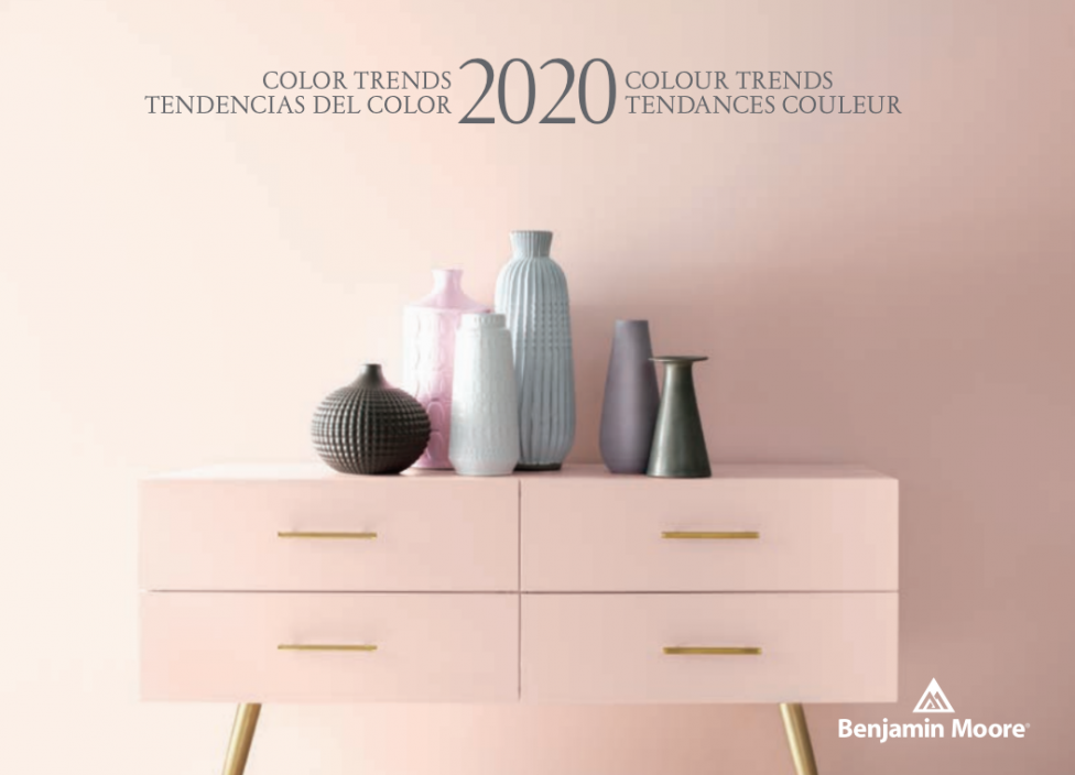
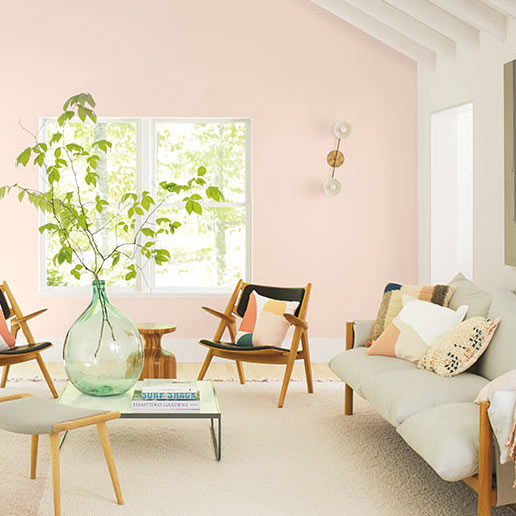
Benjamin Moore is the one company that went away from blue for this year and instead choose a subtle, pale pink shade called First Light. On their website, Benjamin Moore describes the color as “a soft, airy pink that flatters any space and plays well with other colors.”
As with most of the other paint manufacturers, Benjamin Moore not only selects a color of the year, but they put together a handful of colors to show trends that they expect. When looking at the entire collection, it looks like Benjamin Moore has a selected a palette that has a spring or even Easter-like pastel vibe. Maybe it is because we are starting a new decade and spring is the time of renewal. They also seem to be trending very heavily toward the “Mid-Century Modern” design.
Where can you use First Light in your home? The obvious choice is in a little girl’s room but you can be a lot more bold by using this in the main living spaces as well. This would look great in a powder bathroom or a dining room. We have even painted the outside of a home in Ohio City using a similar shade of pink!
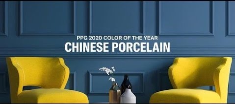
PPG also jumped on the blue bandwagon for 2020 with their Color of the Year selection, Chinese Porcelain. They describe this as a “blend of cobalt and moody ink blue that imparts calmness and restful sleep while also offering the spirit of hopefulness – a precious commodity in a restless world.”
This color is very similar to the Sherwin Williams Naval although not quite as dark. This would also look great on cabinets and provides a slightly more muted gray undertone when compared to Naval.
Dee Schlotter is the Senior Color Manager with PPG and she had this to say about color trends heading in to 2020 “Consumers are tiring of stark grays and are looking to infuse colors that delight the senses. Blue is the easiest possible entry point from the world of neutrals to the world of color, and PPG’s Chinese Porcelain delivers the energy and brightness of cobalt blue – a trending hue taking the automotive, consumer electronics and fashion industry by storm. It also incorporates a deep, muted navy tone that is popular in residential and hospitality design.”
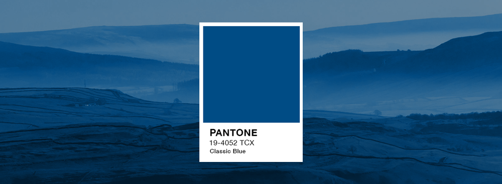
Only slightly different from the color of the year selected by Sherwin Williams and PPG, Pantone’s Color of the Year is “Classic Blue”. As the name suggests, this color can only be described as a class navy blue. Similar to the blues described above, this would look great on kitchen cabinets as well as in a smaller room.
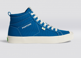
These simple blue color goes well with a lot of different colors and you can expect to see this color not only in home design and paint colors but in automotive finishes and fashion as well. If you want get in the “Color of the Year Spirit” you can even go to this website and purchase a pair of high-top sneakers in Pantone Classic Blue.
How are you going to celebrate the dawn of a new decade? Are you ready for a deep, rich shade of navy blue to make your dining room an intimate gathering space? Is it finally time to paint the kitchen cabinets with a navy lower cabinets (or island) and white upper cabinets? Maybe you’re in love with the mid-century modern look and want to use the pastel colors put forth by Benjamin Moore? Whatever project you have in mind, we would love to help bring it to reality.