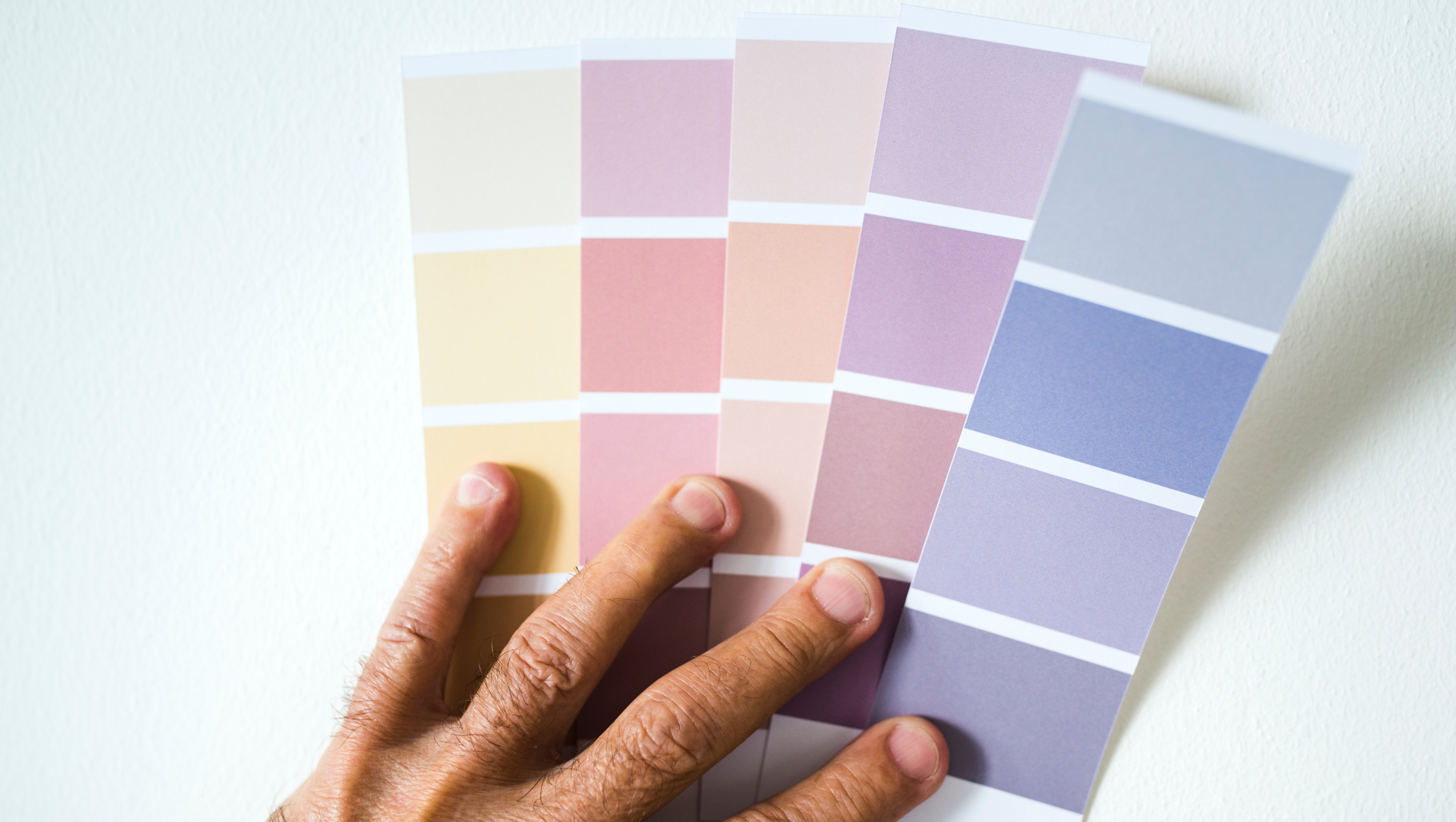
Are you someone that likes to stay up to date on emerging trends? With fashion you can easily buy a few staple pieces to add to your wardrobe, or with food it’s just a matter of switching up what items you place in your shopping cart at the grocery store. But did you know that many major paint companies choose a “Color of the Year” as a starting point to update your interior design? That’s right, there’s another popular trend you can get onboard with. We’ve collected the color choices of five major paint brands to compile a master list of the shades that will be in homes everywhere in 2019. It’s never too late to incorporate these timeless colors into your interior design, whether you decide to paint an entire room or just add a few accent décor pieces. When it comes to summing up the entire year in just one color, these paint brands drew from many different sources of inspiration to make their selections.
- Sherwin Williams: Cavern Clay
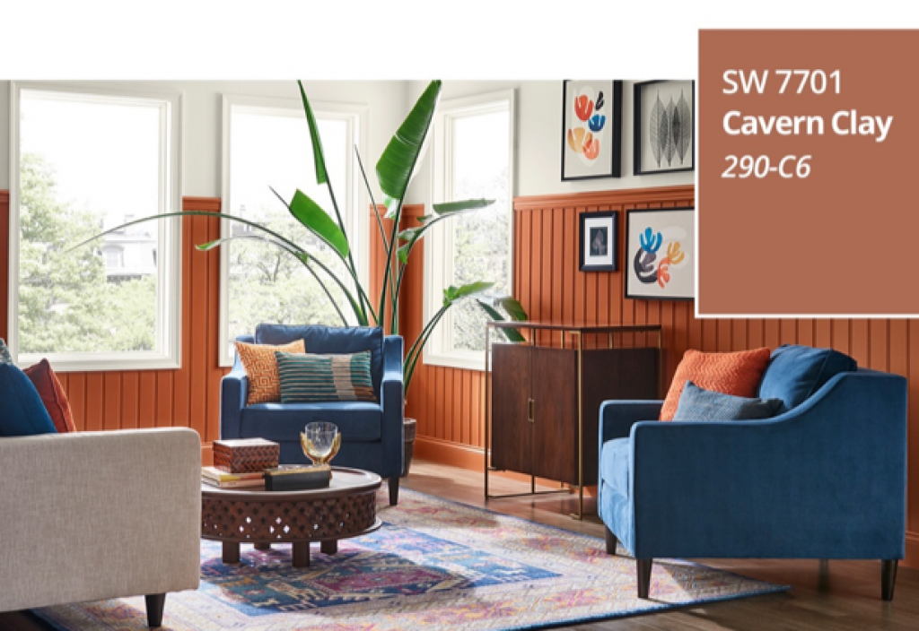
Because their headquarters is in Cleveland, Ohio, it’s only fitting that we start with our neighbor Sherwin Williams. They chose Cavern Clay, a warm terracotta as their 2019 Color of the Year. They elaborate on this color choice as, “a nod to midcentury modern style, but with the soul of the American Southwest, which together creates a desert modern aesthetic.” Taking inspiration from the pigmented terrain, Sherwin Williams chose this color to bring a new life to the realm of earthy toned paints. They say including Cavern Clay into your décor is an “easy way to bring the warmth of the outdoors in,” and quite frankly we couldn’t agree more.
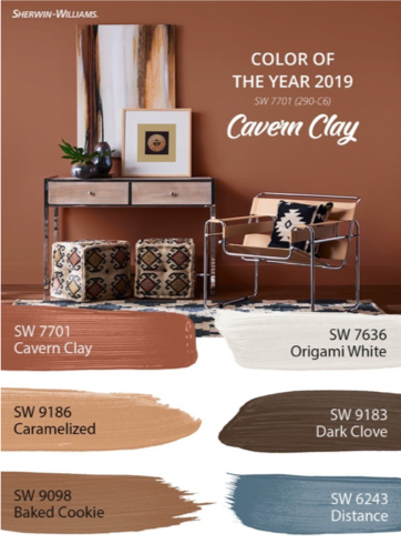
Cavern Clay pairs nicely with other warm-toned neutrals to brighten up any room, such as the similar tones of Caramelized, and Baked Cookie. Or, to pack a bigger punch, pair Cavern Clay with contrasting cool-tones like Distance, Dark Clove or Origami White. To achieve a contemporary style, they recommend using materials like leather, wood, and greenery.
I think I would use Cavern Clay in a living room with a big, leather sectional, black and white pillows and a lot of decorative cacti. An Aztec patterned rug with turquoise accents would add a nice touch to embrace the western roots of this color choice.
For more ideas how to incorporate Cavern Clay into your home, check out the Sherwin Williams site.
- Behr: Blueprint
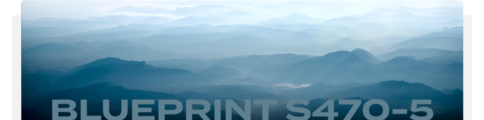
From the opposite side of the spectrum, Behr selected a sophisticated blue-gray called Blueprint. They describe this color as, “a universal tone that feels relaxing to the eye, comforting to the soul and creative for the mind.” Behr says they drew their inspiration for this color from “blueprints that builders rely on to bring architectural designs to life.”
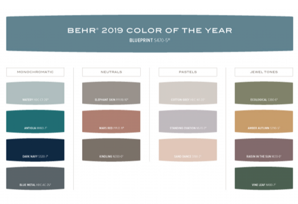
On behr.com, there are interactive color palettes to explore different scheme options for every design aesthetic. By utilizing these suggested palettes, you can determine just how to integrate this adaptable color to any room, from living spaces to bathrooms.
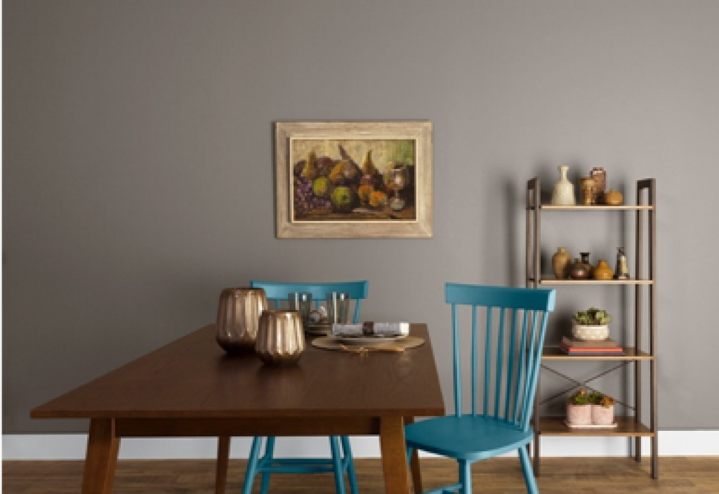
Personally, I like the idea of using Blueprint as an accent color in a room. By painting kitchen chairs or adding a few decorative pillows and embellishing decorations to a more neutral color scheme, this is an easy and budget friendly way to incorporate any of these trending colors. By using this method, it would be a little more attainable to change your interior design with what’s popular each year instead of repainting annually!
To explore different color schemes including Blueprint, head to their website.
- Valspar: 12 Colors!
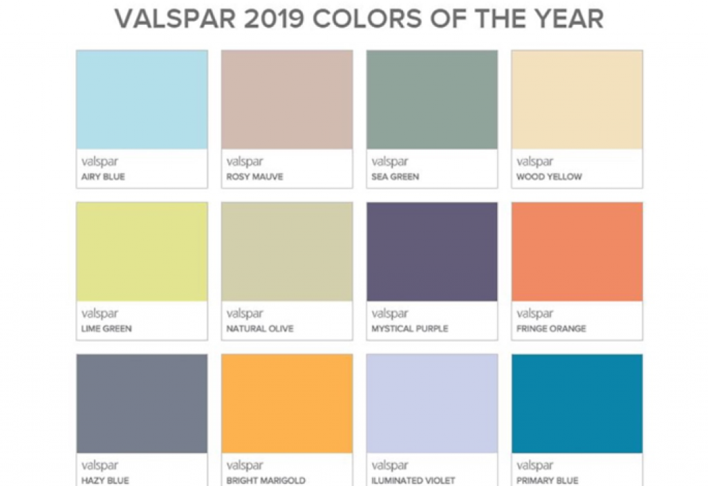
In a world where you can be inspired by every color of the rainbow, why choose just one Color of the Year? Valspar is celebrating ten years of doing annual color reveals by choosing not one but twelve colors to individually represent each month of 2019. Valspar wants each color to “encourage DIYers to embrace change and create a personalized home environment,” according to a press release. Surely anyone can draw inspiration from this fun range of colors!
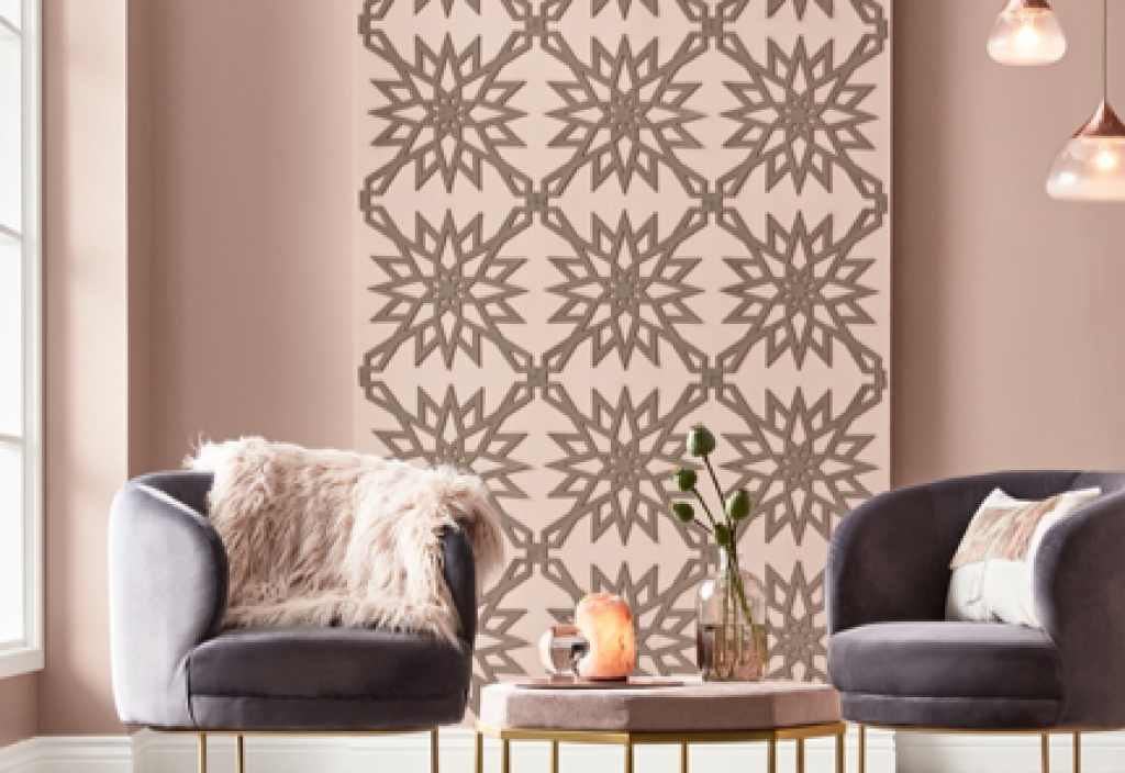
These colors reach both sides of the spectrum from muted neutrals to vibrant, stand out shades. Of these twelve colors, I’m drawn to Rosy Mauve and Illuminated Violet, because they’re unique, without being as in your face bold. Including darker shades of these hues adds a modern style as shown in these photos.
For those that are daring and like a challenge, Bright Marigold, Lime Green and Primary Blue might just be the colors for you to play with in your decor. If styled right, these colors could make for a show stopping space. I say take the leap of faith and create a room so unique that people can’t help but talk about it!
To learn more about why Valspar thinks each color listed below is trending and how to style them in your home, read their full article here.
- Benjamin Moore: Metropolitan
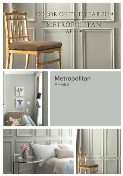
Ellen O’Neill, Benjamin Moore & Co says, “Metropolitan AF-690 emanates nuance, harmony and extravagant ease. Always adaptable, it softens to matte or shimmers with sheen. It’s neutral. It’s understated. It just is. This is color, off-duty.”
Metropolitan is definitely the safest on our list, but that doesn’t make it any less impactful. To pair with this soft gray tone, Benjamin Moore selected 15 colors to perfectly complement its simplicity. These colors range from muted pastels to deeper hues to show how versatile this paint shade can be.
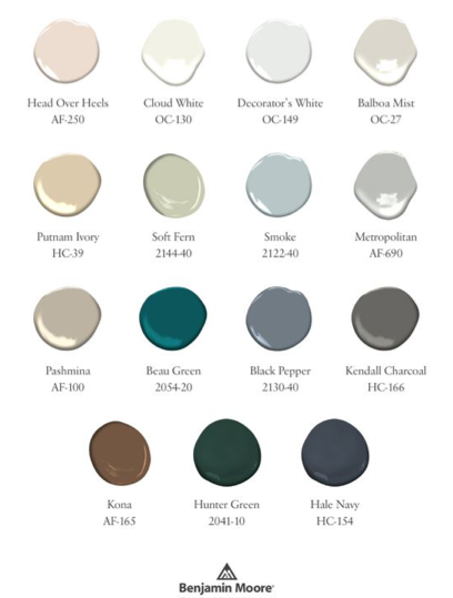
For a soft, modern feel, Metropolitan can be styled with slight variations like Head Over Heels, Cloud White and Smoke to accomplish a monochromatic looking room. For those that want to make this neutral gray the base shade in a color scheme that builds in boldness, I’d pair the hue with Black Pepper, Kendall Charcoal and Beau Green to add a pop of color.
With many color combination options, it might be worth it to get more inspiration from the Benjamin Moore site.
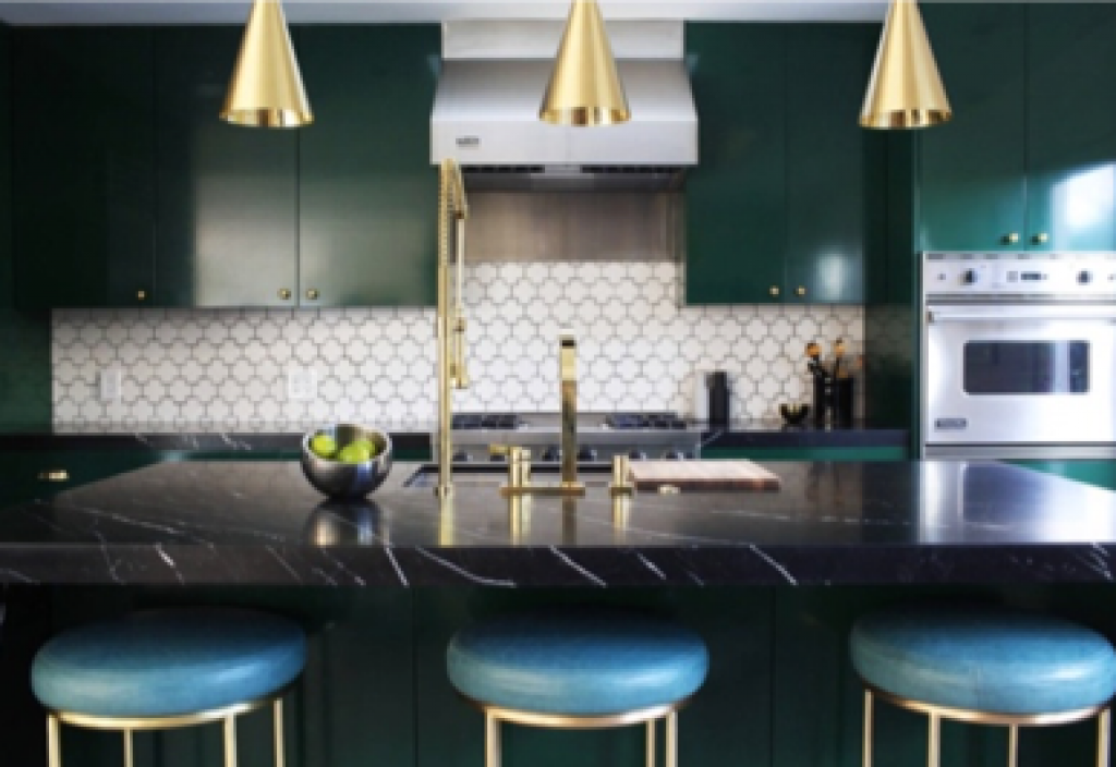
- PPG: Night Watch
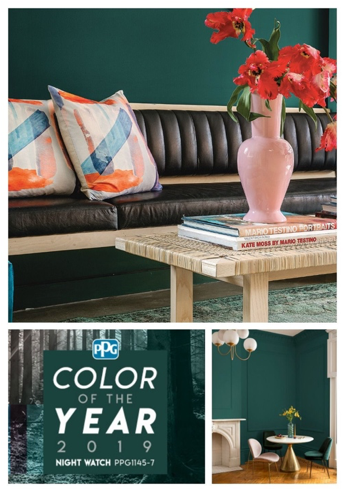
This deep, luxurious looking green is very versatile and can be used as a neutral or as a statement accent.
“Night Watch is about bringing the healing power from the outdoors into your home through color,” explains Dee Schlotter, PPG senior color marketing manager. “The dark green hue pulls our memories of natural environments to the surface to recreate the calming, invigorating euphoria we feel when in nature.”
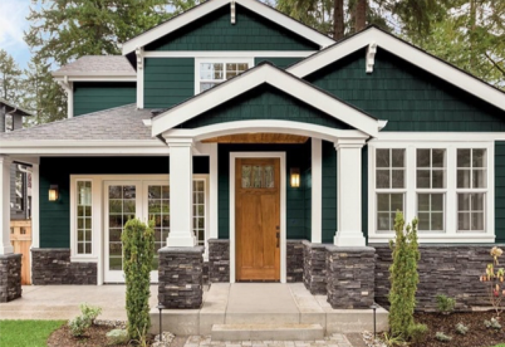
A few examples of how PPG suggests to use this rich color can be used in the interior would be to pair it with mixed metals or contrasting pops of color. Night Watch can even be used on the exterior as an alternative to the trending blue-black or as an accent color on doors or shutters.
I can honestly say I’ve never seen a house exterior painted in this deep green hue but I’m finding myself green with envy thinking about the statement it would make. Paired with a wooden door and white shutters this would create a sleek and modern look that draws positive attention, but isn’t an eyesore in the neighborhood.
Check out PPG’s website for more ideas to utilize this unique hue at your home.
While painting an entire room may seem a little ambitious and unrealistic to redo every year, these five major paint brands shared their take on how keep your space trendy with these timeless hues. Want help with a painting project? Head to our services page to learn about the services we have to offer. If you decide to implement any of these colors in your home, be sure to tag us on social media so we can see your creative take on these 2019 trends!