 We recently wrote an article about the 2018 paint colors of the year but I wanted to better understand the process of how a color is selected and what affect it has on sales. I reached out to the Voice of Color, PPG Paints, to learn about how they selected Black Flame as the color of the year as well as ask for any tips they have on selecting paint colors for your home. Dee Schlotter, PPG Paints Senior Color Marketing Manager, was kind enough to answer my questions and provide great insight on the process.
1. Selecting one color (Black Flame in 2018) as the Color of the Year seems like a daunting task. Can you describe what is involved in selecting the Color of they Year?
 In February 2017, PPG’s more than 20 global color stylists gathered for the eighth consecutive PPG Global Color Forecast workshop. During the three-day meeting, PPG’s color experts came together and discussed societal and regional trends, as well as overarching consumer insights to determine the following year’s color trends forecast, as well as the 2018 Color of the Year.
At this workshop, color experts analyzed the runway, the textile market, the tile, wood and metal markets as well as lifestyles, demographics, geographies and global and cross-cultural societal inspirations to determine what colors would resonate and represent the PPG global color forecast. PPG recognizes that we influence trends as much as trends influence us, and our forecasts represent and connect to current feelings and preferences.
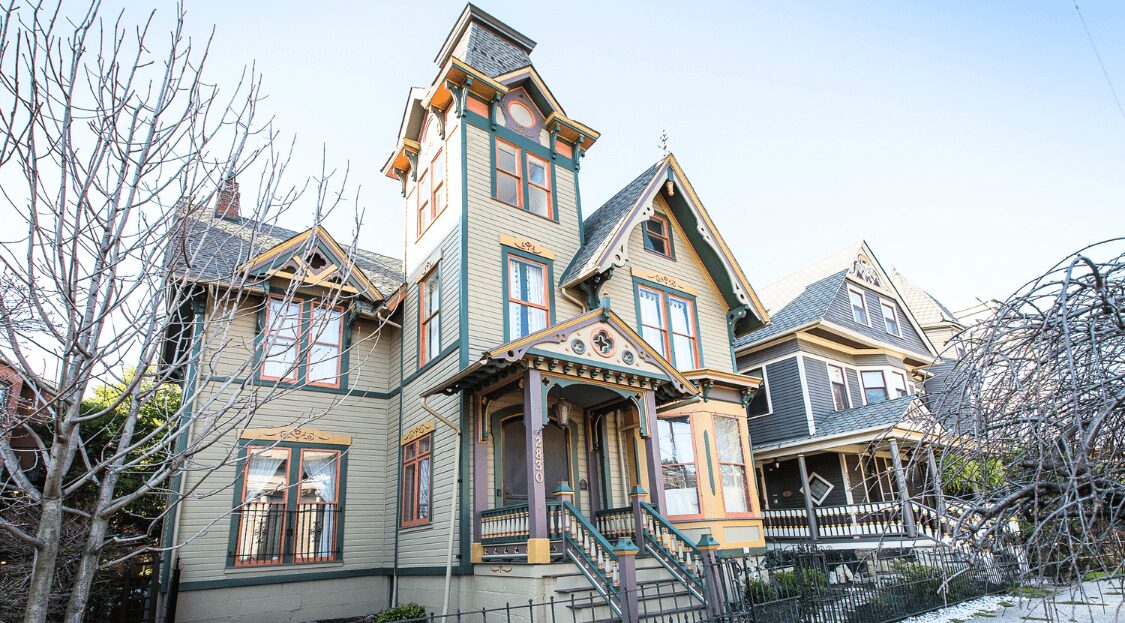
Black Flame (PPG1043-7) was chosen as the PPG PAINTS® 2018 Color of the Year on the final day of the workshop for its ability to represent a variety of different events, consumer personalities and feelings that will dictate 2018 color trends across the automotive, consumer goods, aerospace and architectural coatings industries. We forecast that this color will resonate with our customers across multiple industries because of its versatility and relatability to current consumer cravings. It represents new beginnings, comfort, solace and strength.
2. Were there other colors in close contention?
 While each of PPG’s global color stylists have ideas of what they think might be the next Color of the Year prior to our PPG Global Color Trends Forecast workshop, we’re never 100 percent sure until the final day of the workshop. Determining one single color is difficult, and sometimes the final color choice is heavily debated. We did have another color bubble to the surface that was popular in home décor, but it didn’t resonate with our other themes and trending materials as much as Black Flame.
3. Do you look at recent analytical data trends in actual purchases or is it more of a ‘feel’ for the direction you (and team) see color trends and design trends headed in 2018?
PPG recognizes that we influence trends as much as trends influence us, and our forecasts represent and connect to consumer feelings and preferences. PPG’s color trends forecast gathers information from a wide variety of sources and societal influences, including runway trends, current consumer attitudes, consumer food preferences, current events, build material trends and many, many more sources. PPG also knows that it’s not simply about one color, but rather a combination of trending colors to create an overarching, and all-encompassing color story that resonates with our broad range of customers.
4. How has Black Flame been received by customers, etc.? Does a color being named “Color of the Year” see a big spike in purchases or is it usually already a fairly popular color?
 Bringing a color to the surface from the more than 2,000 colors in the PPG Paints palette always generates interest and favorability. In 2017, tinting of the Color of the Year increased by 300 percent from the previous year.
One of the most interesting places we have seen PPG Paints color Black Flame utilized by customers is on interior doors. These can be closet or room doors or an interior door that leads to the exterior of the home, with a different color on the outside door. The interior door has become the new accent wall and Black Flame provides notice and weight.
Another trending place to feature this color is the exterior body of the home; it is super modern and classic at the same time. Also, in some settings, blackened hues help to quiet the house against a backdrop that is filled with trees and nature.
Recently, we have seen many homeowners using Black Flame as an accent color in their bedroom on the wall behind their beds. It is a truly gorgeous concept. Dark-colored bathrooms are also gaining popularity.
Over the last couple of years, we have seen more mature hues, including grays and colored naturals, used in nurseries. Now, we see even more modern, gender-neutral colors being included, which pairs well with trendy, black nursery bedding.
5. Can you explain the 2018 Color Trends and the color themes?
The 2018 PPG Global Color Trends palettes encompass the below four themes that connect and resonate with current consumer mindsets. Black Flame resides in the Commoner color palette. The PPG Paints brand develops this palette each year to help inform design and color choices for professional customers, from professional painters to designers and architects.
The Retreater theme addresses consumers’ growing need to regularly withdraw from the pressures, chaos and overstimulation that so often come with daily life, and create hygge – a popular Danish concept that embodies all things comforting and cozy. It underscores living well, finding quiet time, making space for one’s self and creating opportunities for calm, balance and peace. Light, airy tones in the palette, such as the PPG Paints brand’s Warmstone, a barely-there blush; Suntan, the perfect nude; Flagstone, a cool gray; and Cuppa Coffee, a warm, woodlike tone, provide subtle hints of color that can be considered neutrals. These hues offer a welcomed escape from a chaotic world.
The Dream Weaver color collection resonates with consumers who embody a perpetual ability to shine, live a free-spirited lifestyle and find creativity under any circumstance. They are the dreamers who hold the light when others prefer to go dark and retreat, which can be shown by their impossible-to-ignore color choices. Muted and ethereal brights round out the collection, with PPG Paints brand colors including Lovely Lilac, a dream-like periwinkle; Summer Sunset, a warm coral; Brandy Snaps, a dusty mauve; and Secret Safari, an earthy green.
The Commoner color palette connects to consumers who are attracted to popular minimalist Nordic-inspired designs, which emphasize going back to basics. Consumers relating most to this palette aspire to accumulate less yet experience more, serve as guardians of the environment, and live with a nomadic spirit. The palette offers unassuming, straightforward PPG Paints brand primary colors such as Mountain Lake, a classic navy; Red Gumball, a deep red; and Grassroots, an organic yellow-green.
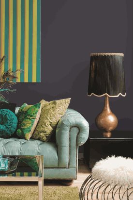
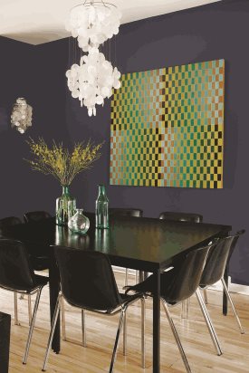
The Brave color story reflects a new design mentality that mimics consumers’ growing yearning for protection, strength and stability to feel safe during uncertain times. The palette evokes feelings of elegance and grandeur, which appeal to consumers’ unwillingness to feel small or disregarded in light of current societal landscapes. The deep, rich colors that make up this substantial palette will be certain to turn heads in any space, including PPG Paints brand colors Charcoal Smoke, a rich forest green; Pinot Noir, a luxurious purple; and Black Elegance, a black with just a hint of gray.
6. On a related note, one of the questions and comments we hear all the time is about the names of paint colors. Could you talk about how colors get their names and what that process looks like? Seems like it would be a fun thing to work on.
Fun it is! The best inspiration often comes from the input of others. We’ve participated in interactive social media threads, posting colors and facilitating conversations, which garnered fascinating responses and new ideas. A few years ago, I even engaged my son’s elementary school for inspiration. Kids are great because they have no filters and sometimes come up with the most unique names. PPG employees have also had the opportunity to participate in the naming process through internal naming contests. We also find that nature books and magazines are useful resources, as they include descriptive color references.
7. What advice would you give to a homeowner trying to find the color they will love for their upcoming paint project?
 Paint colors are personal for each homeowner. The following suggestions are intended to help make the process simpler:
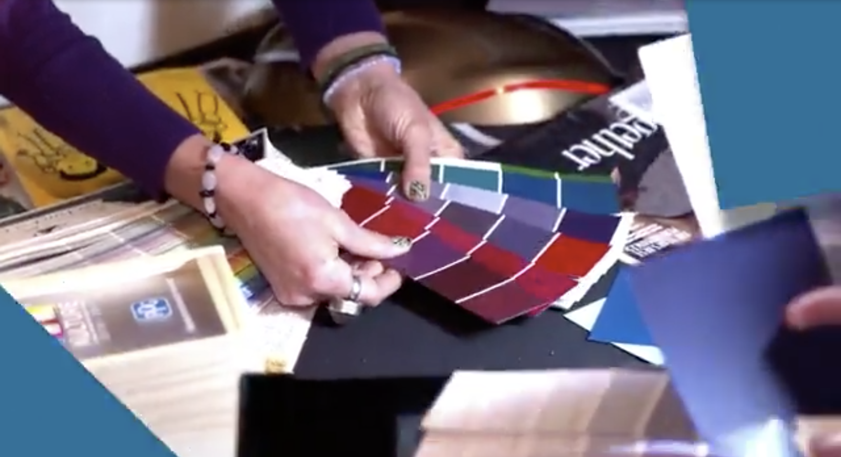
- Prior to selecting a paint color, it is important to first select new or consider existing flooring, fabrics and window treatments. Once these elements are considered, a complementary tone can be selected from the other colors in the room or home’s palette. Select several paint swatches that will coordinate or complement the colors within décor items.
- Rather than holding small paint swatches up against a wall, hold them next to furniture, flooring and window treatments for a visual of how the paint will appear in the space against these elements. PPG Paints offers free 8×8 sample sheets of every color that a consumer or pro painter can order for free at ppgvoiceofcolor.com.
- Once you’ve narrowed down the color selection, paint a 2 feet by 2 feet swatch of the paint on the walls so the homeowner can see the colors against different lighting throughout the day and evening.
- PPG’s new online virtual room painter tool offers advanced technology to apply any color to an uploaded photo of your own space, browse designer color collections and more. This is a great tool to recommend to your clients at the start of their color selection process.
All videos and images were used with permission from PPG Paints.